Last year Vincenzo Cosenza, produced a very useful visualisation highlighting the dominant social networking service by country; this month he has re-done the figures (current June 2010) and the results, while not surprising, really hit home how big Facebook has become; it’s the dominant network in most countries, with a few exceptions like QQ in China and Orkut in Brazil.
(Click to interact with the map.)
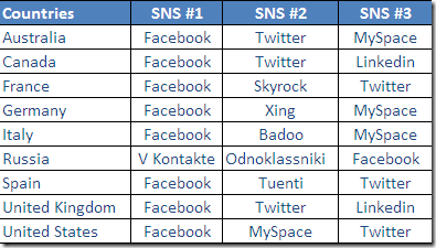
Also of interest in this table, showing the three most popular social networking services in a number of countries. Here in Australia, Facebook dominates, with Twitter in second place, with MySpace hanging on in third; it’s interesting that, despite the hype and media visibility, MySpace still remains number two in the US, while LinkedIN ranks higher in the UK and Canada.


RT @tamaleaver: Interactive World Map of Social Networks (updated to June 2010) http://bit.ly/dcHkWr Shock: Facebook dominates (but MySp …
RT @tamaleaver: Interactive World Map of Social Networks (updated to June 2010) http://bit.ly/dcHkWr Shock: Facebook dominates (but MySp …
World Map of Social Networks (June 2010) « Tama Leaver dot Net http://bit.ly/diyhs4
#Networks World Map of Social Networks (June 2010) « Tama Leaver dot Net: World Map of Social Networks (June 2010)… http://bit.ly/d7q0fz
fascinating map of social networks from @tamaleaver http://icio.us/q3eyrm
World Map of Social Networks (June 2010) «: at Tama Leaver dot Net http://bit.ly/dD0BDS
Facebook : World Map of Social Networks (June 2010) «: at Tama Leaver dot Net http://bit.ly/aCcedW
RT @kcarruthers: fascinating map of social networks from @tamaleaver http://icio.us/q3eyrm
World Map of Social Networks (June 2010) « http://bit.ly/dD0BDS
Love this interactive map of social networks http://bit.ly/aka86H